I never received formal training in design and as I started to build web products in 2012, it was a learning curve. Certain ideologies on what I like about different products guided me. There is of course a lot of design lingo that I picked up over the years. Yes, the usual suspects like “CTA”, “Above the fold”, “How many clicks does it take…” etc etc.
However, good design isn’t a factor of learning jargons or spending money on expensive consultants. I have seen some hyper funded products with poor experience and some very well executed apps by a single person effort. For this reason, it becomes important for founders to educate themselves a bit about what makes their product more usable. Today, I want to talk about one of the most common fallacies of UX – Trying to make things faster by eliminating steps.
Don’t we hate apps that introduce a LOT of clicks during checkout? It may be for various reasons like confirming order details (qty, price etc), address and payment mode. In some cases there are steps induced for up-selling (Hey Godaddy!). And given that all of us have suffered terrible UX, we strive to make our own apps / products easier to use. Often by reducing steps.
It occurred to me some time back when making Pricebaba that everything that we want our users to experience cannot be fitted on a single screen easily and we would need to live with the fact that there are certain users who would engage and some who won’t. Let’s not ignore the experience of consumers who do engage with us!
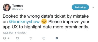
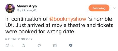
Here is an example of how the fallacy of reducing steps affects real users. Till date I have twice booked movie tickets for a wrong date. And the third time the same thing was going to happen, I was convinced that it isn’t just my way of using Bookmyshow, but a design flaw. Bookmyshow always assumes that you are booking tickets for the current date or the first day of movie release in case you are booking before release.
I am also provided with this statistics that 83% of their users book tickets for the same day. This has prompted Bookmyshow to make the remaining 17% users vulnerable to book the wrong date. And clearly I am not alone.
Our data shows 83% of the booking on the same day and 56% of booking 1-2hr before the show.
— kiran (@kiran6390) May 15, 2017
No design is full / fool proof. But if so many power users have fallen for this, there must be a cause right? In my view DATE is a very crucial part of any ticketing and should not be assumed. No matter how effective you want to make the experience for majority of your users.

Will Bookmyshow users who want to see a movie, NOT book a ticket with BMS if they are prompted to select the date? Or are we okay with 17% of users being at a risk of losing their entire booking amount (given tickets are non refundable / changeable)?
In fact the fierce race to make the experience fast for 83% of user, BMS team ends up forcing the date even after the user has selected another date. See video below:
So next time you are designing an aspect of your product, do consider that going too fast can be error prone and also unnerving / uncomfortable for some users. If the core value proposition of your product or service is good, users will complete the flow.
Can you think of more such design fallacies? Ping me or comment below.
That video clearly shows an oversight of the team rather than a UX flaw. I do agree that the assumption based on data can have wrong consequences. Specially if data is read incorrectly. I’m not sure when BMS says 83%, they mean 83% of their customers or 83% of their bookings. If later, their bad design is affecting almost 100% of the customers over the long period.
I am sure they are referring to Bookings/Individual orders and not customers.
The video shows that the team got very focussed on giving a ultra smooth experience to users who want to book for the same day. And thus made errors.